
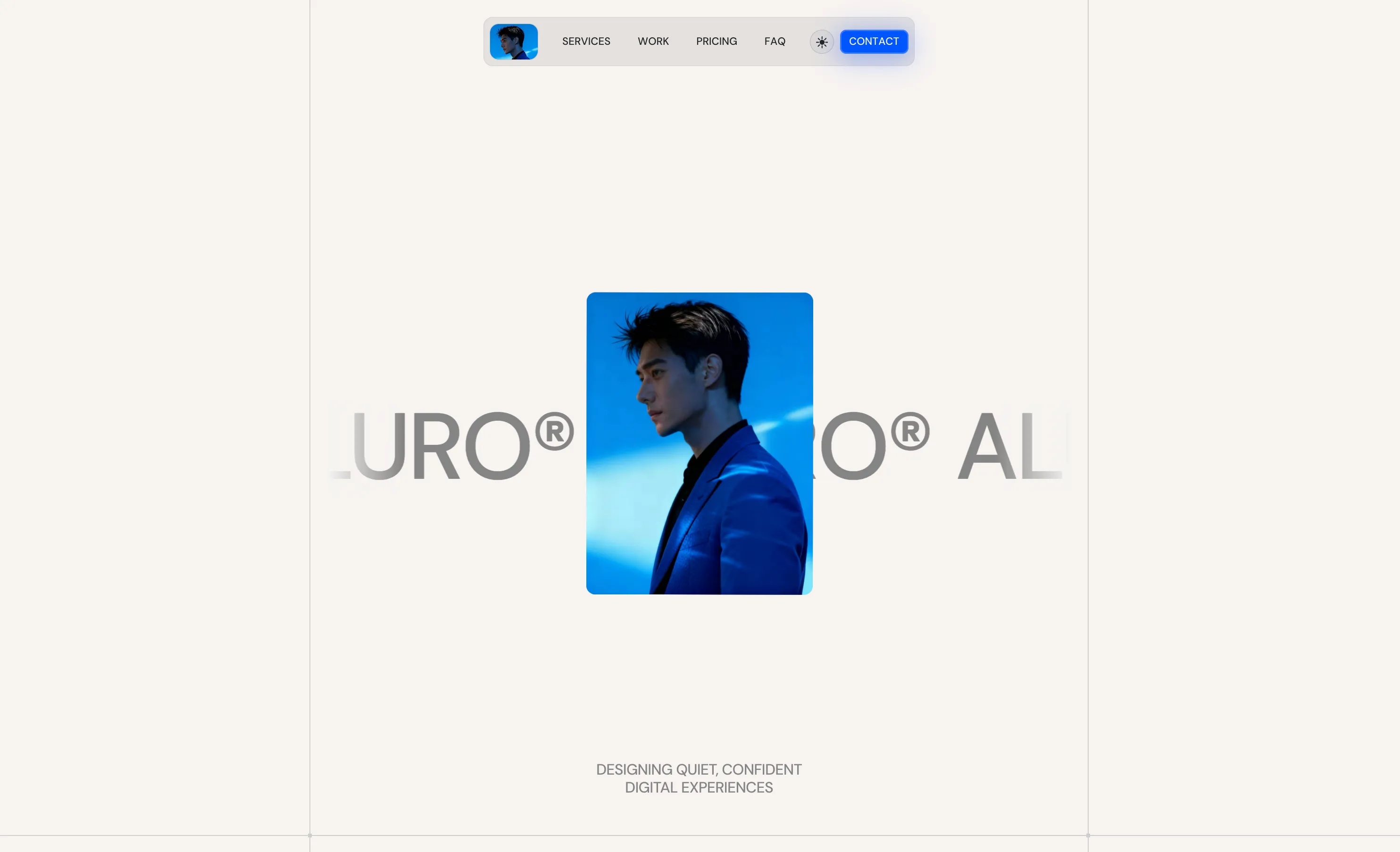
Lumina Studio
Auralis — Product Landing Page
Auralis is a sound-design startup that needed a focused one-page site to explain what it does in seconds. The goal was a landing page that feels calm, modern, and confident, while guiding visitors to try the product.
Role and scope
- UI/UX design
- Visual direction
- Interaction design
- Hand-off and documentation
Objectives
- Communicate value in the first screen
- Show product visuals without clutter
- Create a simple path to sign up or request a demo
- Keep performance, accessibility, and readability strong
Audience
Producers and content teams who care about audio quality and time savings. They browse quickly, compare tools, and expect a clean, trustworthy experience.
Approach
The page is structured like a short story: a clear hero, three value points, a product preview, social proof, and a direct call to action. Typography carries the voice, imagery carries the feeling, and motion highlights what matters.
Design highlights
- Hero: large headline with a single supporting sentence and one primary action. Secondary link points to feature details.
- Value grid: three concise points with small icons. Each card expands on hover to reveal one sentence of detail.
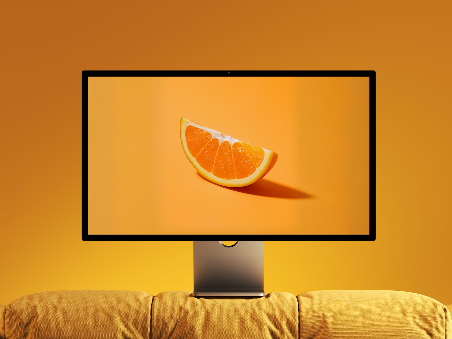
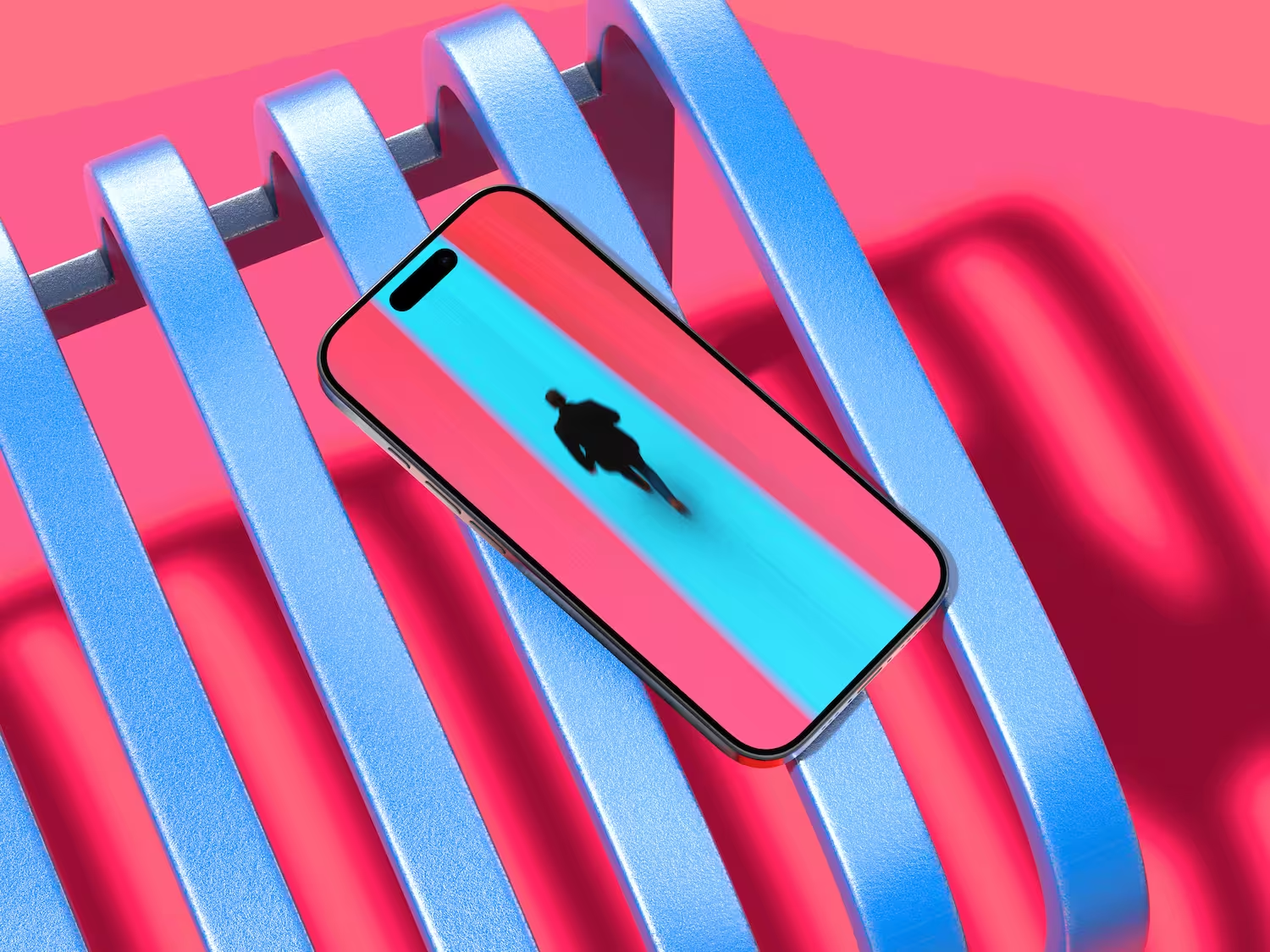
- Product preview: static frames and a short loop that shows the core flow. No autoplay audio.
- Social proof: selected logos and one featured quote to build trust fast.
- CTA section: short line, one primary action, one link to pricing or demo.
Visual language
- Type: geometric sans for headlines paired with a neutral grotesk for body. Tight leading, generous spacing.
- Color: dark base with a restrained green accent for actions and highlights.
- Imagery: crisp UI crops, soft shadows, and plenty of negative space.
Interactions
- Motion is used to explain, not to decorate. Buttons elevate slightly on hover, cards reveal micro-details, and sections fade in gently as they enter the viewport. The page feels alive without demanding attention.
Accessibility and performance
- Minimum 16 px body size, strong color contrast, clear focus states, and keyboard-friendly navigation.
- Images are optimized and lazy-loaded. Animations respect reduced-motion preferences.
Outcome
The landing page improved first-screen comprehension and reduced friction in the path to sign up.
- +28% click-through on the primary CTA in the hero
- +19% time on page for visitors from ads
- −24% bounce on mobile
“Clean, fast, and exactly the tone we wanted. The new page finally explains Auralis without getting in the way.”
Services delivered
Website design, UI/UX design, visual direction, interaction design, design system setup, hand-off docs.
Tools
Figma for design and prototyping, Webflow for build, lightweight motion for micro-interactions.
More Cases
%20(1).avif)
.avif)